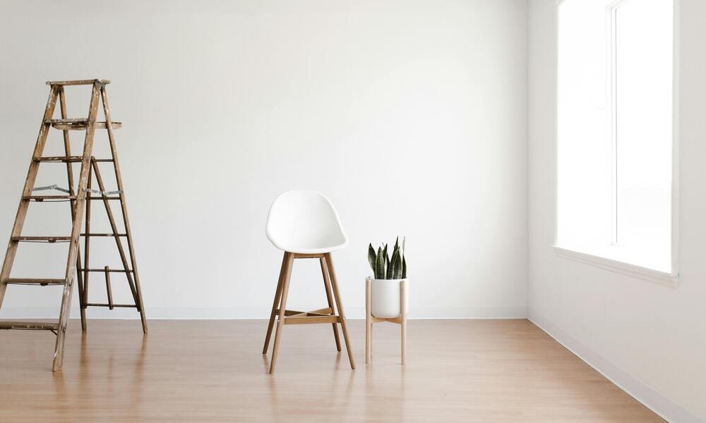
Minimalist home design emphasizes simplicity, functionality, and a clutter-free environment. One of the most crucial elements in minimalist design is the use of color. While many people associate minimalism with a strict palette of white, beige, or gray, color plays a significant role in creating a balanced and serene living space. In this blog, we’ll dive deep into how different colors can enhance minimalist home design, providing a sense of calm, sophistication, and personal touch to your home.
Understanding Minimalist Design
Before we explore the role of color, it’s essential to understand the principles of minimalist design. Minimalism is characterized by:
- Simplicity: Minimalist design focuses on the essentials, eliminating unnecessary items and emphasizing clean lines and open spaces.
- Functionality: Every item in a minimalist home should serve a purpose. Functional design ensures that each piece contributes to the overall aesthetic and utility of the space.
- Clarity: Minimalism seeks to create a clear and serene environment, free from visual clutter and distractions.
Color in minimalist design is not just about choosing hues; it’s about enhancing these principles and contributing to a cohesive and peaceful atmosphere.
The Basics of Color Theory
Understanding color theory can significantly influence your design choices. Color theory involves the study of how colors interact, combine, and affect our perceptions and emotions. Here’s a brief overview:
- Primary Colors: Red, blue, and yellow are the primary colors from which other colors are derived.
- Secondary Colors: These are created by mixing two primary colors, such as green (blue + yellow), orange (red + yellow), and purple (red + blue).
- Tertiary Colors: These are made by mixing a primary color with a secondary color, creating hues like teal, vermilion, and chartreuse.
- Color Wheel: A tool used to visualize relationships between colors. Complementary colors (opposite on the wheel) create high contrast, while analogous colors (next to each other) create harmony.
By applying these principles, you can make informed decisions about how to use color in your minimalist home design.
Neutral Colors in Minimalist Design
Neutral colors form the foundation of minimalist design. They create a clean, versatile backdrop that allows other colors and textures to shine. Here’s a deeper look at how to use neutral colors effectively:
White
White is the quintessential color for minimalist design. It reflects light, making spaces feel more extensive and brighter. Here’s how to use white:
- Walls: White walls can make a room feel open and airy. They also provide a blank canvas for incorporating various textures and accents.
- Furniture: White furniture can blend seamlessly with other elements in the room, ensuring that the focus remains on the overall design rather than individual pieces.
- Textures: Incorporate different textures, like a white wool rug or linen curtains, to add depth and warmth to the space.
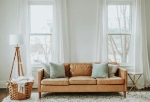
Example: In a minimalist living room, white walls paired with a white sofa and a light wood coffee table can create a serene and welcoming environment. Adding a few green plants and a textured rug can break up the monotony and introduce a natural element.
Beige
Beige adds warmth to a minimalist space while maintaining the simplicity that defines minimalism. It is less stark than white and can make a space feel cozier.
- Walls and Floors: Beige walls and floors provide a soft, inviting backdrop that can easily complement various furniture styles and colors.
- Accessories: Beige accessories, such as throw pillows, blankets, and rugs, can add layers of comfort without overwhelming the space.
Example: In a minimalist bedroom, beige walls combined with white bedding and a wooden bed frame can create a soothing retreat. Beige throw pillows and a soft rug can enhance the comfort while keeping the design simple.
Gray
Gray is a versatile neutral color that can add sophistication and depth to a minimalist home. It ranges from light, airy grays to dark, dramatic tones.
- Light Gray: Light gray can make a room feel open and calm, similar to white but with a touch of warmth.
- Dark Gray: Dark gray can be used to create focal points and add contrast. It works well as an accent color or for creating a statement wall.
Example: In a minimalist kitchen, light gray cabinets and countertops can create a sleek, modern look. Dark gray accents, such as a backsplash or appliances, can provide contrast and visual interest.
Black
Black can be used sparingly in minimalist design to add contrast and elegance. It should be used strategically to avoid making the space feel too dark or heavy.
- Accents: Black accents, like light fixtures, picture frames, or furniture, can add sophistication and a touch of modernity.
- Contrasts: Pair black with lighter colors to create striking contrasts and focal points.
Example: A minimalist office can benefit from a black desk and chair against white walls. This combination creates a professional and clean look while allowing the space to remain open and uncluttered.
Incorporating Accent Colors
Accent colors add personality and interest to a minimalist space without overwhelming it. They can be introduced through various elements, such as artwork, cushions, and decorative objects.
Blue
Blue is known for its calming and soothing effects. It can create a serene environment and is versatile enough to fit into various rooms.
- Light Blue: Ideal for creating a sense of calm and space, light blue works well in bedrooms and bathrooms.
- Dark Blue: Adds depth and sophistication. It can be used for statement pieces or accents.
Example: A light blue rug and throw pillows in a white minimalist living room can introduce a calming touch. Dark blue accents, such as a navy blue armchair or artwork, can add depth and create a focal point.
Green
Green brings a touch of nature into the home, creating a refreshing and rejuvenating atmosphere.
- Soft Green: Perfect for creating a tranquil and relaxing environment. Use it in bedrooms or bathrooms.
- Deep Green: Adds richness and can be used for statement pieces or to complement other colors.
Example: In a minimalist dining room, a soft green table runner and a few potted plants can bring in a natural element while maintaining the room’s simplicity.
Yellow
Yellow adds warmth and energy to a minimalist space. It can be used to brighten up a room and create a cheerful atmosphere.
- Soft Yellow: Ideal for creating a sunny and inviting feel. Use it in living areas or kitchens.
- Bright Yellow: Can be used as a bold accent to energize the space.
Example: A soft yellow vase or a set of yellow cushions can brighten up a minimalist living room. For a more vibrant touch, consider a bright yellow artwork or throw blanket.
Pink
Pink introduces a gentle and soothing element to a minimalist home. It can create a warm and inviting atmosphere without being overpowering.
- Blush Pink: Ideal for creating a romantic and calming environment. Use it in bedrooms or living rooms.
- Bold Pink: Adds a pop of color and can be used sparingly for accents.
Example: In a minimalist bedroom, blush pink bedding and throw pillows can add warmth and softness. A bold pink piece of art or a small pink accessory can serve as an eye-catching detail.
Tips for Using Color in Minimalist Design
Incorporating color into minimalist design requires a careful approach to maintain balance and simplicity. Here are some tips to help you use color effectively:
- Create a Color Palette: Choose a limited color palette to ensure harmony and cohesion. Stick to a few colors and use different shades and textures to add depth.
- Balance Color and Space: Ensure that color accents do not overwhelm the space. Use them to complement the minimalist design rather than dominate it.
- Use Color to Define Zones: In open-plan spaces, use color to define different areas or functions. For example, a different color on a feature wall can create a distinct area for dining or relaxation.
- Incorporate Textures: Adding textures through rugs, cushions, and curtains can enhance the impact of color. Textures can create visual interest without adding clutter.
- Consider Lighting: Color can look different under various lighting conditions. Test colors in different lighting before making final decisions.
- Update Accents: Change accent colors with the seasons or trends to refresh the space without major redesigns. Accessories like cushions and artwork can be easily updated.
Practical Applications of Color in Different Rooms
Living Room
In the living room, the use of color can create a welcoming and relaxing environment. Start with neutral walls and larger furniture pieces. Add accent colors through cushions, rugs, and artwork. Consider a feature wall in a soft, soothing color to enhance the room’s mood.
Example: A white living room with a light gray sofa can be enhanced with blue and green cushions. A soft blue rug and a few green plants can add color and warmth without cluttering the space.
Bedroom
The bedroom is a space for relaxation and rest. Use calming colors like soft blues, greens, or blush pinks to create a soothing atmosphere. Incorporate color through bedding, curtains, and rugs.
Example: A bedroom with light gray walls and white furniture can be complemented by blush pink bedding and throw pillows. A soft pink rug and a few decorative items can complete the look.
Kitchen
In the kitchen, color can create an inviting and functional space. Use neutral colors for cabinets and countertops, and add accents with colorful dishes, utensils, or small appliances.
Example: A white kitchen with light gray cabinets can be brightened with yellow kitchen accessories and a green plant. A colorful backsplash can also add a touch of personality.
Bathroom
For the bathroom, use colors that promote relaxation and cleanliness. Light blues, greens, and soft grays work well. Add color through towels, bath mats, and shower curtains.
Example: A minimalist bathroom with white tiles and fixtures can be enhanced with a light gray bath mat, soft blue towels, and a green plant for a touch of nature.
Conclusion
Color plays a vital role in minimalist home design, contributing to the overall atmosphere and aesthetic. By understanding color theory and using neutral colors as a base, you can create a serene and harmonious space. Accent colors can add personality and interest without overwhelming the minimalist principles. Remember to balance colors, textures, and lighting to achieve a cohesive and inviting home.
FAQs
Can I use bright colors in a minimalist home?
Yes, bright colors can be used in a minimalist home, but they should be applied sparingly as accents. Too much bright color can disrupt the clean and simple look that defines minimalism. Consider using bright colors in smaller elements like cushions or artwork.
What are the best neutral colors for minimalist design?
The best neutral colors for minimalist design are white, beige, gray, and black. These colors provide a versatile and clean backdrop that can be easily complemented with accent colors and textures.
How can I add warmth to a minimalist home?
To add warmth to a minimalist home, use warm neutral colors such as beige and light gray. Incorporate natural materials like wood and stone, and add soft textures through rugs, throw pillows, and blankets.
Can I use patterns in minimalist design?
Yes, patterns can be used in minimalist design, but they should be simple and subtle. Avoid using too many patterns or bold designs, as this can create visual clutter. Opt for understated patterns that complement the overall design.
How can I create contrast in a minimalist home?
Create contrast in a minimalist home by using light and dark colors together, such as pairing light walls with dark furniture. You can also use different textures and materials to add depth and visual interest.
What are some good accent colors for minimalist design?
Good accent colors for minimalist design include blue, green, yellow, and pink. These colors can be introduced through accessories and decorative items to add personality and interest without overwhelming the space.